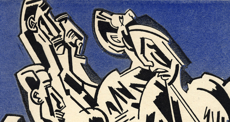
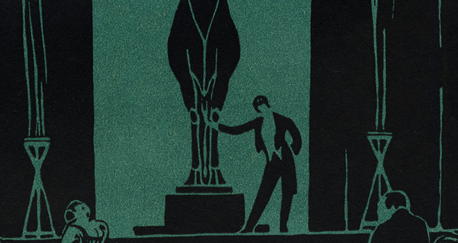
Surreal Eyes-wk 11

Modernist writing, by design or by subconscious impulse, includes the body as a frequent feature. In previous journals, there was a focus on hands, usually referred to by their color and size (here in this issue, actually, one instance refers to “broad hands, palms black with pitch and hairy backs” (24)). In transition 1927, the surrealist literary journal, it is not hands as much (although they are mentioned 31 times) but eyes that feature—or rather doesn’t feature. In this one issue, eyes are brought up 57 times. Eyes reveal interiority. For instance, eyes “round and black…they had realized the true character of this mild demagogue” (37); eyes that “filled with tears and highlights, and waves of strange emotion had rocked her and transported her from one to another” (40); “their eyes pierce the night, greedily and restlessly” (46); “eyes lie at a distance, and the pupil is misty, immovably grey” (70). In these examples, eyes themselves drive the perception of character, which, in turn, drives the action out of reaction. Art, too, betrays itself of the subconscious anxiety about eyes in avoiding them. Take, for example, the pieces on page 111 and 112. On 111, Jeunes Filles en des Belles Poses, or young girls in beautiful poses, what we see are the backs of two young girls, their legs, butts, and backs, but we do not see their faces. One of them doesn’t even have a head. The man, who appears either to be praising them or soon to slap an ass with an upraised hand, is drawn in a different form—a skeleton sketch rather than a true likeness—has a jawline, a left arm upright like the girls, and a mouth, but his eyes fade into nothingness. In “Painting,” on page 112, the woman in the painting, other than a somewhat oddly-shaped hand, could almost be described as normal, other than the giant fish covering her face. The animals on the triangle beside her are also eyeless, except for one lion who faces away and has one black void for an eye. Although surrealism is an attempt at the subconscious mind, the sides of the brain still function within their roles. Language and writing process through the left side of the brain, whereas painting would process through the creative right side of the brain. What this suggests is that the left side of the brain that can write about eyes and describe them carefully enough to communicate, while the right side of the mind may be avoidant of eyes and, in that avoidance, communicate similar ideas that the left does with words. Does not a woman with a fish over her suggest a woman whose “eyes lie at a distance” (112; 46).  

Random Aesthetics - DADA

One of the things that I really enjoy about DADA is how out there the art movements of the time were. The image used for "DADA: The Art History Archive - Art Movements" page shows how DADA did not fit just a single (if any) art style. In fact, as long as the you made something that tied into what was going on around the world at the time, but in an almost absurd way, it could be considered DADA. This is all seen in the fact that "DADA" was picked at random, a French word meaning "hobbyhorse" (The Art History Archive) and Russian for "yes, yes" (MOMA). 

Due to this, I found it really interesting to look at the differences between "Dada" (July 1917) and "Entretiens" (August 1893). "Entretiens" was published before the DADA movement ever became a blip on anyone's radar, and as such there is a higher focus on the text itself. In fact, in this particular issue there is not a single photo or piece of artwork, and instead reads more like a short novel (even though the texts are from different authors and on different subjects). "Entretiens" was a magazine that was meant to get people to think about the information being presented solely through text. In comparision, the first issue of "Dada" is twenty-two pages long (including the cover pages) with  eight images throughout, an one on the very front cover. The visual artwork of the DADA period held as much importance to what was being discussed as the written or performed artwork. I would also like to point out that even though Wyndham Lewis was making artwork during the Vorticism movement, there are moments when I can see the Vorticism influence on DADA, which makes sense as Vorticism was active during 1914 and 1915. The images on pages five, eleven, and thirteen of "Dada" especially remind me of Vorticism. 

A Neo-Dada Event

A few years back I had a piece of mine accepted into a neo-dadaist magazine called Maintenant published by a New York Press called Three Rooms Press. It was one of the first poems I wrote during my MFA, and I wanted to offload it on whatever magazine would have it. The poem, pasted below, was a Pynchonian mess: the kind of poem someone would write out of general protest after moving to the only MFA program that would take them: a small liberal arts school in Milledgeville, GA (where Flannery O’Connor wrote her stories of apocalypse, violence, and greed). I’m not sure if it’s Dada. I’m not sure if the editors at Three Rooms did either. There’s a touch of cosmopolitan anxiety, a threat of violence, maybe. Maybe that’s the Dada element they saw. The poem was, to me, about all the humiliating ways people try to be different. The poem’s nightmarish apartment building is a kind of thought experiment about what walking away from neo-liberalism might look like: a guy fussing with his toilet lid.

There was a Zoom reading for all the contributors. Thurston Moore of Sonic Youth was published in the same issue, but he didn’t come. Dressed up in their little digital square, the editors looked ridiculous. They had put streamers in their hair, and they blew on kazoos from time to time. They made little jokes after each reader. They asked me what my favorite Italian food was, when they pronounced my last name. One old man sang his poem. One reader read ten minutes over time. The editors blew their kazoos and told him it was over. He went to long. It was time for someone else. Their face turned read, and they left. Another reader enlisted all his friends to dance his poem. It was embarrassing. The editors knew it. That’s why they dressed funny, as if to tell you they had no part in any of this. Everyone else was embarrassing. They only dressed so.  They asked me what my favorite Italian food was, when they pronounced my last name. I read my poem and hung up.

I’m not sure who was more Dada. The contributors for their withering irony, Thurston Moore for just not showing up, or the old man singing his bad poem a capella. The Dada manifesto is like any other modernist manifesto. The art is in the telling; not the doing. Most of the actual Dada is cuter than it is subversive—a silly joke played at the expense of the believers—a very sad grad student writing poems to a few kazoo playing editors who just don’t give a shit.


NOISE

There’s something wrong with Mr. Bradddworth,

the new gray tenant.

He’s freakishly tall and skinny

and frayed at both ends,

like a ribbon unwoven

deliberately over time.

It’s not just me.

We tenants heard from up there

these big bangs followed by

these littler bangs,

like a super-ball bouncing

against our teeth,

and we’ve spilt beer

over this all night

in agony.

He showed up last month

with a bag

(one bag)

and hasn’t left his room—

401A, building C.

And the landlord,

born without legs

enough to climb his own stairs,

is spilt beer.

So we go up there,

all of us tenants,

and knock on Bradddworth’s door.

And Miss Silverstein

(with a 5 for both S’s)

brought her spider,

in a glass jar.

Mi55 5ilver5tein smartly

punched holes in the lid.

Mi55e5 5pider’s beer is spilt.

And ‘Ugly’ Derrick ‘Jimmy’ Malloy,

whose pimple scars

look like tattoos in the right light,

is jimmying the lock,

which makes, itself, quiet little bangs.

My brain is a drum,

or a piece of tight cloth.

With the door unlocked,

we rush in,

spilling beer,

and there’s no furniture

save the GOOD VIBES!

poster in the corner of the room,

latticed by the sun, which is

caught in the novelty animal print blinds,

and a TV, blue between inputs.

There’s something wrong with Mr. Bradddworth,

standing at his spotlessly

clean toilet,

lifting

and dropping

the lid,

over and          over and          over and.

It’s the sound of a can opening—

its gas shooting out of the red ears

of Bradddworth’s

big, empty head, which

Mi55 5ilver5tein says

we ought to split

under the lid.

What the Dada? (6 of 8)

So, making sense of nonsense? Dada has a whimsical yet apathetic feeling about it. The Manifesto is Anti-Manifesto. It claims beauty is dead. What do they mean by that? The concept of beauty or all beauty? They claim man can’t be boxed in by ideals and that the Bible can’t explain everything. So man has no limits according to them, but there are still limitations outside of morality? Dada wants independence vs. unity, so we cannot all get along. Why can’t a person be independent and still get along with others that they may not be in lock step with in thought? These kind of ideologies seem to have an all or nothing pattern. They can be so creative with art, but with thought battle each other for supremacy.  

In the Anti-Manifesto, they mention everything is false. Then why are you writing and why am I reading this and supposed to trust you? Don’t trust my own logic? Then what am I supposed to use? Dada is paradoxical, a kind of ‘I have no brain and I must think’ instead of mouth and scream. I’m guessing this is one of the precursors to the whole idea of countercultural revolutions of thought and action. Instead of art being for the public, Dada argues art is supposed to be for the artist. One could make that argument, but it also implies the artist is of a selfish nature if they will not share with others. They seem to be making the assumption that an artist who is loved by the public is a sellout. Would you call Rembrandt or Picasso or Warhol sellouts? I find this line of reasoning to be quite flawed if funny. The artists who stand the test of time did NOT just think about themselves, they were often influenced by the humanity that lived and suffered around them. I’m not sure what they hope to gain by saying morality creates atrophy, but I much rather an artist care about their subjects and people when they paint than being emotionally cut off from society and our problems. 

Too Dada for Dada-wk9

When was a flaming supporter of contentious political groups, like the communists and the socialists says “America is too Dada for a Dadaist movement,” it probably is (23).  Aesthete (1925) quotes Waldo Frank here. He isn’t speaking against the Dada movement but that Dada breaks out of “an environment of order and tradition,” and the United States is not a place that could be considered orderly or traditional from its founding days. However, Frank is also not speaking against the Dada movement, merely that the naming convention in the US is inexact. In fact, it appears as though Frank believes that Americans are Dada naturally. Frank, an associate editor for The Seven Arts, a little journal that believed in “evok[ing] and mobiliz[ing] all our native talent, both creative and critical” may have actually been using this article in the 1925 Aesthete to argue that citizens of the US should stop comparing their own movements to Europe and, instead, see that they are naturally creative and capable of their own movements. They can counter Dada with their own ideas. However, it is equally possible that, as a supporter of communists, Frank is communicating here that the US should be anti-Dada, anti irrational, one might say, and instead embrace the rationality of embracing the production of the collective whole. The future doesn’t lie in individualism but in collectivism. The US was born into individualism—individualism is why they left England!—so an even stronger individualistic reaction doesn’t quite make sense. Instead, Frank may be arguing, be radical by not being individualistic! That’ll show ‘em! 

Dada's Dues

Hannah Hege's "The Magazine as Strategy: Tristan Tzara's Dada and the Seminole Role of Dada Art Journals in the Dada Movement" tracks the way Dada art defines itself in early twentieth century magazines. However, the essay stops short of indicating any sort of relation between the Dadaists and the Vorticists. Perhaps this relationship is missing or, at the very least, untraceable. Yet in Hege's descriptions of Dada, I found myself thinking of Blast, which had been printed in 1917--three years after the first issue of Blast was published. Hege writes, "Tzara adopted the magazine as a strategy for launching the Dada movement. Particularly in these early years, Dada defined and essentially constituted Dada for readers, and in fact it was in coming up with a name for this journal that the Zurich artists christened their movement" (36). Tzara's intention with Dada sounds similar to Wyndham Lewis' own plans for Blast--also launched to clarify and define the Vorticism movement. While the name of Blast is not the name of the movement, even the intention behind the name defines how Vorticism blasts out pre-conceived notions of how art and literature should operate. In addition, Hege also adds, "Assuming an appellation with no preordained meaning, the Dadaists also refused to define their aims clearly through a manifesto or mission statement" (36). While Blast certainly has a manifesto, Blast's manifesto is often ignored by its own artists--if not contradictory within its "definition" of what should be and should not be blasted. Blast equally refuses to be penned into a strict guideline of what Vorticism is and isn't. 

Alongside this similar intention behind the two magazines, the similarity in contributions also interests me. Hoge's essay includes art that was in an issue of Dada, and the art itself not only contributes to how the movement was inspired by other modernist movements, but how it shapes the Dada movement as well. Blast included art to a similar degree--though of course, Blast seemed less eager to look at the movements that had come before it. In this minor way, the magazines differ; and yet, this difference seems less interesting to me than intention. Discounting the way Dada does not mind looking back at other traditions, both magazines are using art that is not only strange and new, but also contributes to a new movement itself. 

My question, then, is just how closely these two magazines are intertwined? This would require further research (more, at least, than my quick Google searches can locate). However, I do not think it is a stretch to conjecture that Blast, a magazine that made ripples in the literary and art circles, was a defining influence on how Tzara designed Dada as a magazine.

Dada and Uselessness

I took particular interest in Marcel Duchamp this week, not because of his art or poetry, but because he left that world to play chess. As I read through the secondary readings for the week on MOMA, I learned that he liked chess because it was useless. Art, poetry, the urinal piece that appears in Blindman no. 2 and caught attention from many artists, could be used in some way by the art world—sold/commodified, displayed, etc.

In that Blindman issue, there is a discussion of the urinal that was displayed and signed by “R. Mutt”: “It is a fixture that you see every day in plumbers’ show windows. Whether Mr. Mutt with his own hands made the fountain or not has no importance… He took an ordinary article of life, placed it so that its useful significance disappeared under the new title and point of view—created a new thought for that object.” There is play here, and an argument, between the ordinary and the elevated. This idea is continued in the “Buddha of the Bathroom” piece. I would revise this to be the useful and the useless. Duchamp’s “Readymade” series places exceptionally useful objects and tools (urinals, shovels, stools, bicycle wheels, etc.) and isolates them in a way that strips those objects of their function. It’s a change in thought, sure, but one that is asks the audience to question usefulness, function, and purpose. In “Buddha” the author cites people comparing Duchamp’s/Mutt’s “Fountain” to high art. While I see this as challenging conceptions of aesthetic beauty and authorship, I’m most drawn to the ideas of “imagination”—“Fountain was not made by a plumber but by the force of an imagination; and of imagination it has been said, ‘All men are shocked by it and some overthrown by it.’” With the Readymades Duchamp is forcing audiences out of their preconceived notions of how to use a tool (logic, common sense, usefulness) and into a space that requires imagination from the audience to surmise its purpose. If this is “joke” as the author of “Buddha” suggests, then that imaginative energy is made completely useless. Tzara’s “Dada Means Nothing” can easily be translated to “Dada [art] is useless” for Duchamp.

The secondary sources want us to understand Dada as doing something-- attempting to challenge accepted ideas in the art world, be anti-war, inspire new perspectives, etc. But Duchamp’s move away from art to chess is telling. There is a certain uselessness to chess; it’s a game with its own language and logic that doesn’t translate to a clear impact on the world. It exists completely for itself, demanding considerable time and energy yet is nonmaterial (nothing concrete is produced after a game of chess). Duchamps seemed to find in chess, then, the ultimate in uselessness.

Just Keep Swimming

Demuth's poem in The Blind Man compares to Norton’s essay in some unexpected ways. Louise Norton’s essay, “Buddha of the Bathroom” hovers ominously over Demuth’s short dedicated poem, "For Richard Mutt," which seems to identify a type of people, “the going.” Demuth writes, “For the going everything has an idea” (6). Momentum and meta-concepts (the conceiving of concepts?) are clearly important to the poem, and they imply a sense of objectivity, from the perspective of this group—the going. Everything for them (artists like Mutt) can be put into terms of formal traits: the going group thinks about the thinking of the thing, not the thing itself. Therefore, it’s not a piece of plumbing, it’s a piece of art. The poem, as literary artworks often do, gestures to the ideational as integral to the nature of art. Norton addresses this too, but I find that there are differences between Norton’s critique “Progress, Speed, and Efficiency” and what Demuth indicates. At least I think Norton is critiquing the concept: she compares it to a dog chasing its own tail, implying whimsical distraction or playfulness. If it isn’t quite a critique, Norton is at the least ambivalent about these concepts/deities the Westerners worship. My main point is how speed, efficiency, and progress are understood differently in these two works. The way that speed is associated with efficiency and progress in Norton’s makes me read deeper into “the going” concept in Demuth. It’s a positive thing to progress and keep moving, says the pro-Mutt poem. And Mutt can do that. There’s a sort of praise of movement, momentum, artistic progress (not style/convention but innovation) that appears partially formed or inverted in the Norton piece. Yet they both have relatively positive outlooks on the same artist, from what I can tell. I’m thinking about concepts of editorial theory now and how it might be effective to place these clearly different approaches to the same artist side by side. At some level though, I’m also laughing at myself because my instincts tell me how silly it feels to try and critically analyze dadaist/dadaist-adjacent work. Nevertheless, I’ll keep going.

Blast - A Thought Experiment

Besides The Crisis, Blast has to be one of my favorite magazines that we have read so far this semester because of the fact that it relies just as much on how the information and images are formatted, as what the information and images are discussing. The first piece of text in Blast (number 1) is titled “Long Live the Vortex!” and is made up of individual sentences – some of which are entirely capitalized. It states:

               Long live the great art vortex sprung up in the centre of this town!

               We stand for the Reality of the Present – not for the sentimental Future, or the sacripant Past.

               We want to leave Nature and Men alone.

               We do not want to make people wear Futurist Patches, or fuss men to take to pink and sky-blue trousers.

               We are not their wives or tailors.

               The only way Humanity can help artists is to remain independent and work unconsciously.

               WE NEED THE UNCONSCIOUSNESS OF HUMANITY – their stupidity, animalism and dreams. (Blast, number 1)

Not only is the text telling the readers what the purpose of the magazine is (showing just what makes an artist, and how to keep them relevant), but it also places an importance on what will be discussed within the magazine – the Reality of the Present over the sentimental Future or sacripant Past; the relationship between Nature and Men; Humanity and how it relates to art and artists. Mark Morrison points out in ”Blast: An Introduction” that “Blast was a manifesto … intended to promote a nascent avant-garde group comprising of painters, writers, and a sculptor.” This is not only seen in “Long Live the Vortex!” but also in the way that the other texts within the magazine were organized. They are not in a steady font or size, they do not follow the rules that have been established for any type of literature (magazine, novel, etc.), nor do they always cover the entire page of the magazine that they reside on. Instead, readers are shown where to focus first through the size of the font and the use of negative space on the pages. Readers are forced to think about why these decisions were made and what that means in relation to the information presented.

Blast!; To Blast

It took until I read the Introduction to Blast that I registered the title as an expletive. Since “oh blast!” might be more often used ironically than emphatically by Americans, the term’s connotations of explosions, fractures, and ruptures dominated my view. As a verb, that is, “to blast,” couples with the expletive to exemplify the vortex on which Vorticists based their movement. This twinned, paradoxically opposite, inseparably infused yet distinct, ethos of the movement is also notable in Peppis’s analysis of “The Crowd Master.” “Taken as a whole,” Peppis writes, “‘The Crowd Master’  neither celebrates a Crowd Master nor masters the crowd,” (113-14). This reservation of, as Peppis sees it, a clear stance in support of either strong-man or sociological writing also attests to the very volatile position Vorticism holds in British prewar, mid-war culture. In the face of its rupturing thematics, Vorticism does not forego all of the values and customs of imperialism as it imports notable flagship traits of the political style—military/economic dominance. I find it interesting that Blast supports (somewhat?) other quasi-fascist, violent/militaristic aesthetics and outlooks, particularly Italian Futurism, while teasing it. Vorticist interest in classification by (and critique of other) nationalities overlaps with their attention to their region's affordances of material production, like fast cars. Morrisson’s piece covers this, and it reminds me of the classification of Pound’s “Studies in Contemporary Mentality” with “The Spectator” in last week’s reading. This compulsion to classify individual human characteristics based on local, regional (national) history and custom feels just as romantic as Lewis claims Germany (the Prussian Establishment) is, and it is an obsessive concern with the Vorticists and their associates. But, especially in The War Number, nationalist sentiment, patriotism, is a sort of trial for an individual to be heroic, on the homefront industrially (even aesthetically?), or in the trenches. The war posters, emphasize this, too. The Vorticists apparently want to rupture and fracture everything, but acknowledge how the fractures are contained within a greater whole (I’m still riffing off of the vortex symbology here). That is, Peppis points my attention to the yes, and aspects of what I would afore-now only consider a nationalist artistic movement worthy of study, yes, but also one I would readily dismiss as a dramatic and bratty failure of aesthetics.

Blast Cover II (blog 5 of 8)

Based on our readings of Vorticism this week, and how much we are able to glean from the artwork of magazines, I wanted to put that together to analyze and dissect my thoughts on the art movement this week. The cover is black and white, which emphasizes the boldness of the art. The Vorticist artists in Blast seem to be at war with everyone, much like the World War at the time. Instead of bombs and guns, though, they are in a war of art and ideas. They also seem to be obsessed with mixing art and politics. The blood of the war, much like ink, has seeped into the pages of their second magazine. War is chaos, and part of the image is buildings that are thrown into disarray, as if some will come out of the ground and some will grow under the soldier’s feet. The chaos is also lobbed with a “Blast” as the Vorticists fight with literature to make their movement dominant in the public sphere. The black and white is in lines so harsh and sharp they make me think of barbed wire that will cut a person if they touch it with bare hands. Words can hurt people too, if thrown carelessly or used as a weapon in politics for gaining power and crushing enemies. The Vorticists wanted to be on top even if it meant pushing other art movements underneath themselves, possibly to destroy them, but most definitely to demean them to uplift themselves. The men in the picture are almost unrecognizable as humans, with angular and flat features. Their eyes are as black as the death they saw and dealt out. The guns almost melt into their arms, and they become extensions of the human body. The Vorticists use the pen in the same way to fight for their ideals which become extensions of themselves. The battle of wills and conflict raged on in more ways than just the trenches. 

Lusty Women Strip Plums-wk 8

“Indissoluble Matrimony” by Rebecca West, contained within the first edition of Blast June 1914, presents a woman with qualities both fiercely feminine and fiercely fierce. Her husband, on the other hand, presents with qualities some might call feminine. In this representation, West subverts traditional marital roles and plays out an image of the modern woman. One who might, given the opportunity, do such things as speak at a socialist gathering. Mrs. Silverton is presented as a sexual creature, with poor table-setting skills, who is smart with money and a strong swimmer. In every category, she is described with hyperbolic-level adjectives: a woman who mourns “savage[ly]”, who eats her bread with “crushing honey”, and is “over-sexed” (101; 99; 102 (Ironically—or not ironically—savagery is also listed in Blast I’s Manifesto: “The artist of the modern movement is a savage” [33]).

Mr. Silverton, on the other hand, is a disappointed eater (though does not appear intent on helping with meal prep), jealous, and weak. In his jealousy, he describes himself as feeling “torture[d]” by Evadne and feeling as though he could break down in “hysterical sobs” (103). This sort of hysteria is often attributed to overreactive women, not men. The tables feel intentionally turned here, with the woman in the relationship having the emotional control. Silverton also does not have control over his wife’s body: “Bodies like his do not kill bodies like hers” which he describes as being “lusty” (117). Brains like his also don’t kill brains like hers, however, as in his attempt to gas poison the two of them, he realizes that Evadne has turned off the main line to prevent leaks, a “thrifty habit” of hers (117). The scene ends with a recognition that he will always be hers, whether he likes it or not, and describes how she “caressed him with warm arms” as the final line of the piece (117). This protective act also communicates a sort of masculine energy, as she demonstrates a sort of possession. Evadne is sharper witted, stronger built, and more emotionally stable than her husband. In this piece, West presents an image of the vivacious modern woman and what men will be reduced down to (one who might “sneeze[] exhaustingly…from physical distress” after a fight and swim) if they do not rise to the occasion and recognize, support, the woman they have, not the table maid they think they want. This piece, published just one month before the start of World War I, feels before its time. Though it is well within the date range for the suffragette movement, it precedes the social advancement women would experience during the first world war.  

"The Crisis" and Information

After reading Keene’s piece and looking at the June 1918 issue of “The Crisis,” I was interested in large separation between the official information and information that “The Crisis” is putting forward alongside it. The “Editorial” section of this edition of “The Crisis” especially shows how the editors were doing their best to help with the war effort, but they were also showing their criticisms about the lack of information that was either being presented by the official propaganda, or the lack of information that African Americans had in general. “Our First Great Tragedy of the War” on page 60 draws attention to this separation – the government asking for the help of those they had beaten down and had not given the same education that had been give to white Americans. J. B. Watson even starts his editorial section with, “I have seen thousands of Negro men received into the provisional army of the United States who cannot read or write” (p. 60). In starting his section in this way Watson starts a conversation regarding the lack of information that was given to African Americans, and this continues through his entire letter as he talks about the lack of geographical knowledge, the lack of knowledge on what the war was about, and even a certain expectation of how long the war would take. All of this is then placed in direct relation with Watson’s ending statement, “We are glad they have been called. All honor to these black men that ‘they are making a fine showing,’ as reads the report from every camp,” (p. 60). Even with the lack of information that was given during the recruitment process, the African American community were still glad to have been called on – they were still glad that they were able to do this for this for their country. However, there was also a sense that while they were honored to have been called on and that they were able to represent their country in such a way, they were still well aware of what they were lacking as citizens. The education that Watson discusses, Jim Crow laws still being active, and the over-all feeling that they were limited as citizens were all talking points within “The Crisis.”

War in Keene and Crisis

In Jennifer Keene's "Images of Racial Pride: African American Propaganda Posters in the First World War," Keene writes about the efforts to appeal war propaganda to black Americans. It is interesting, then, to consider the reaction of The Crisis to such efforts, when the February 1913 issue of The Crisis states, "Our record for clean advertising is history. No exaggerated statements or impossible propositions are permitted in our columns" (198). Of course, the publishers of The Crisis are referring to advertisements--but what are some forms of propaganda if not advertisements? More on this, The Crisis itself seems to define its response to war fairly neatly in the October 1914 issue: "Then the Lord of Hosts moved out of the temple and looked down upon the earth. As they have sowed So shall they reap. Let it go on, He said" (297). In short, The Crisis pre-US entry into World War I seems to indicate a lack of interest--or rather, as Daniel mentions in his blog post, the perception of the war as justice.

How then does The Crisis so radically change its views?

As discussed in class, the war promised opportunity for black advancement. Keene writes, "Many saw the war as a chance to advance the civil rights agenda. Here was an opportunity to prove their metal in battle and demosntrate both the key role they played in the economy and their willingness to sacrifice and die to ensure their nation's security" (207). The Crisis matches this view in later years, such as in their June 1918 issue. The cover of the "Soldiers Number" seems to have several layers to its intention. The first and most obvious layer is in prominently displaying a black man in a soldier's uniform. There can be no doubt that The Crisis is situating its viewership right in the midst of this American crisis. The man is a soldier, and his sacrfices are the same as his white countrymen. There is also the red, white, and blue colors--another symbol of claiming full citizenship as Americans.

In this view of equality, then, it might be argued that The Crisis does not view its own endorsement of the war as "impossible propositions." That would, in itself, be an anti-thesis to The Crisis--even as the seeming endorsement of war might not. 

You Eat with Your Eyes First -wk 7

Humans are visual. Written content can go far, but written content paired with intentional image selection can go so much further. The Crisis leverages this idea to the same end with different means in their October 1914 issue and June 1918 issues. The thesis, if you will, of the October 1914 issue is: Don’t fight somebody else’s war when there’s war enough at home. To emphasize this point, the issue shows dozens of images of children (such as the cover image). These images are emphasized further with language like, “cry, little children, cry and cry loud and soon, for until you and the Mothers speak, the men of the world bend stupid and crazed beneath the burden of hate and death. Behold, this old and awful world is but one slaughter-pen, one tale of innocent blood and senseless hate and strife” (290). There is a direct call to avoid war and fight on the homefront for racial justice. The June 1918 issue has the same heart to it, with its thesis being: Fight the war at home by proving yourself in the war abroad. Rather than images of children, it features images of strong, upright soldiers (as demonstrated by the cover image). Language such as, “Out of this war will rise… an American Negro, with the right to vote and the right to work and the right to live without insult. These things may not and will not come at once; but they are written in the stars, and the first step toward them is victory for the armies of the Allies” (60). The heart of the argument is the same as the one in 1914: achieve racial equality, but the means by which to achieve that has shifted from abstinence of foreign battle to engagement. It is worth noting that, though the cover images of these two issues have wildly different content (one a sweet, somber little girl making direct eye contact and one a broad-shouldered, iron-backed soldier), they have a similar color scheme. Both of these covers, unlike the covers of other issues of The Crisis are red. When discussing war, it is not a far stretch to associate the color red with the color blood. What this communicates is the idea that bloodshed is inevitable, whether the war is at home or abroad. However, the images tied with the color scheme seems to simultaneously suggest that while there is blood, there is purpose. 

Pages